

Why Color Placement Near Your Face Matters Most
Color theory is often taught as a rigid system — warm tones for warm skin, cool tones for cool skin, full stop. In practice, the system is more flexible and more personal than that. What matters most is how a color interacts with the specific undertones, depth, and characteristics of your complexion, not a broad category assignment.
The practical priority is proximity. Colors close to your face — the neckline of a shirt, a scarf, a jacket collar — have a direct and visible effect on how your skin reads to others. They can make you look rested or tired, vivid or muted. Colors far from your face, like the shade of your jeans or your shoes, matter much less in this context.
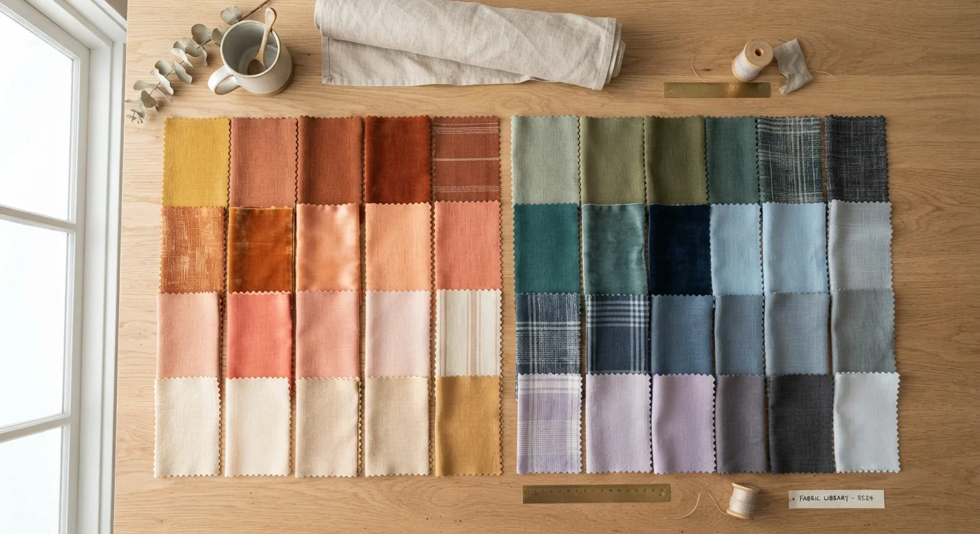
This is why the testing method in the steps below focuses on holding fabric near your chin and jaw rather than looking at it across the room or on a digital screen. Your eye needs to evaluate the interaction — not just the color in isolation. If you've encountered style rules that feel limiting, color restrictions are often among the ones worth questioning most.
What you will need
What to Do After You've Found Your Colors
Once you've worked through the steps and identified a set of consistently flattering shades, the goal is to make that knowledge usable in your daily life — not to create a rigid checklist.
Start by noting whether your best colors skew warm, cool, or mixed. Then identify two to four anchor shades that show up as reliable favorites — these become the backbone of your most wearable wardrobe pieces. Mixing within your identified palette generally produces cohesive, put-together looks without much effort, which pairs well with pattern and texture mixing strategies if you want to add visual interest.
Build a Simple Color Reference Card
Once you identify your most flattering shades, write them down — specific color names or descriptions — and keep the list in your phone. Referring to it while shopping or getting dressed removes hesitation and helps you build a wardrobe that works together more consistently.
It's also worth noting that your undertone is fairly stable over time, but your preferences and lifestyle evolve. Revisit this exercise periodically — especially if your hair color changes significantly, since hair frames your face and shifts how surrounding colors are perceived. For a broader understanding of your complexion, understanding your actual skin type can also add useful context.
Color Rules Are Guidelines, Not Laws
No color is objectively off-limits based on skin tone, hair color, or any other physical trait. These frameworks exist to help you make confident choices faster — not to restrict what you wear. If a color makes you feel great and you receive compliments in it, that is meaningful data worth trusting.
The content on this site is for informational purposes only and is not a substitute for professional advice. Always consult a qualified professional for guidance specific to your situation.