

Why Pattern Mixing Feels Harder Than It Is
Pattern mixing has a reputation for being an advanced styling move — something left to fashion editors and people with a naturally bold eye. In reality, it operates on a small set of consistent principles that anyone can learn and apply. The reason it feels difficult is mostly that nobody explains the principles clearly. Instead, readers get vague advice like "trust your instincts" or rules so rigid they eliminate half the wardrobe. Neither actually helps.
If you've ever felt like your outfit looked chaotic after combining two prints you liked individually, you weren't failing at style — you were missing one or two specific tools. This guide walks through those tools in order, from the most foundational to the most flexible, so you can build up your confidence step by step.
Worth noting: some widely repeated style rules actually make this harder than it needs to be. The article Style Rules That Sound Helpful but Quietly Make Getting Dressed Harder examines exactly which pieces of common advice are worth questioning before you internalize them.
What you will need
The Core Principles at Work
Before moving through the steps, it helps to understand what you're actually managing when you mix patterns. Two main factors determine whether the combination reads as intentional or accidental: scale and color relationship.
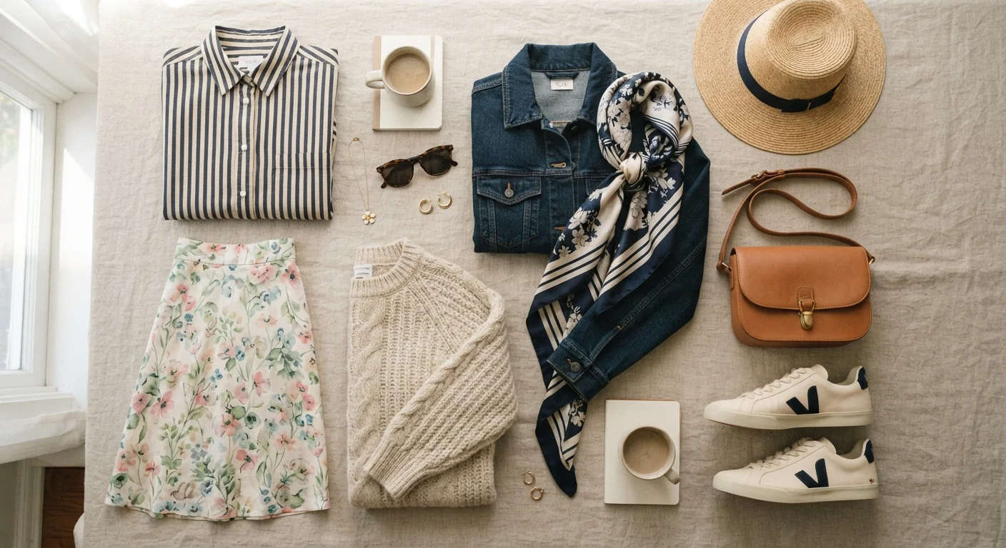
Scale refers to how large the repeat of a pattern is. A wide-stripe shirt has a large-scale pattern. A small ditsy floral has a small-scale one. When two patterns share the same scale, they fight for visual dominance. When they differ — one large, one small — your eye naturally moves between them in a way that feels resolved rather than tense.
Color relationship is what ties patterns together. If a plaid and a floral share even one color in common, the eye reads them as a pair rather than a collision. The shared color doesn't need to dominate both pieces — it just needs to appear in each.
Texture follows the same logic but without print: pairing a smooth cotton shirt with a nubby tweed blazer creates contrast that reads as considered rather than careless. Texture-only mixing is also a lower-stakes entry point if you're not yet comfortable layering two printed pieces.
For a broader look at building outfits from reliable combinations, Outfit Formulas That Take the Guesswork Out of Getting Dressed offers a practical framework that works alongside pattern mixing.
Texture Mixing Is a Lower-Stakes Starting Point
If two printed pieces still feel like too much, try mixing one print with one textured solid instead. A striped shirt with a tweed blazer or a floral blouse with a ribbed knit cardigan gives you visual interest without the complexity of managing two print scales simultaneously. Once that combination feels natural, adding a second print becomes a much smaller step.
Troubleshooting Common Problems
Even with the right principles, a few recurring issues tend to trip people up.
The outfit looks too busy. Add a neutral piece — a solid white shirt underneath a patterned blazer, or plain black trousers under a printed top. Neutrals give the eye a place to rest and make the patterns feel more intentional by comparison.
The patterns clash even though the colors match. This usually means both patterns are the same scale. Try swapping one piece for something with a distinctly larger or smaller repeat. A thin stripe paired with a bold geometric reads far more clearly than two medium-scale patterns in the same palette.
The texture combination feels flat rather than rich. Texture contrast works best when the surface finishes are genuinely different — matte against sheen, rough weave against smooth knit. If both pieces are roughly the same weight and finish, the layering won't register. Understanding your color palette also helps narrow texture choices; Figuring Out What Colors Actually Work for You can help you build a reliable base to work from.
Finally, if your budget shapes how you build your wardrobe — as it does for most people — Dressing Well on a Tight Budget shows how to get more mileage from what you already own, which matters especially when experimenting with new combinations.
Avoid Matching Patterns Too Precisely
Trying to find patterns that are nearly identical — same colors, same scale, same style — usually reads as an accidental near-match rather than an intentional pairing. Contrast is what makes mixing look deliberate. Aim for relationship, not repetition: the pieces should feel like they belong to the same story, not like they're trying to be the same sentence.
The content on this site is for informational purposes only and is not a substitute for professional advice. Always consult a qualified professional for guidance specific to your situation.